Pantone's Colours of 2016
Every year, Pantone declares a colour of the year. This is the result of 2 days of secret talks, presentations and debate held twice yearly in a European capital with representatives from various nations' colour standards groups. At the end of this they choose their colour of the year.
The colour they choose is meant to tap into the consciousness of the time; it's the spirit of the year, represented in colour.
Pantone themselves describe it as: "A symbolic color selection; a color snapshot of what we see taking place in our culture that serves as an expression of a mood and an attitude."
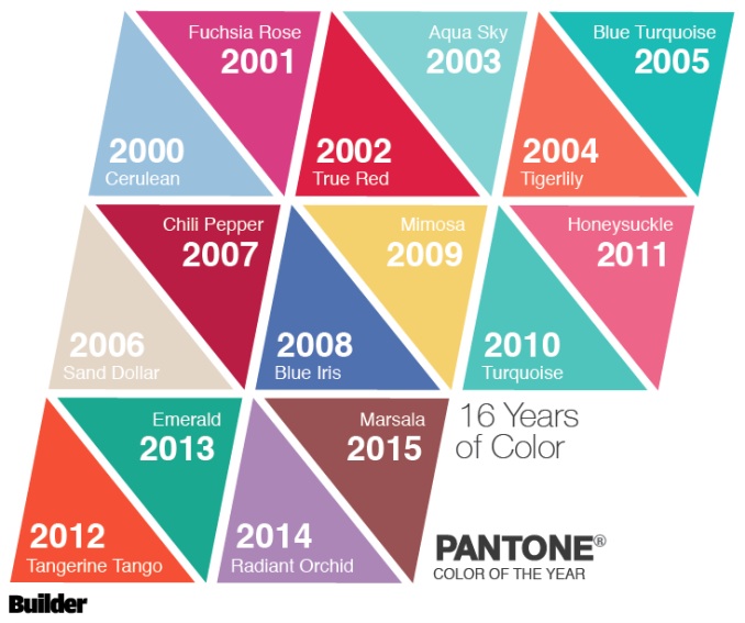
Previous years colour choices have been varied, though blues and greens feature heavily:
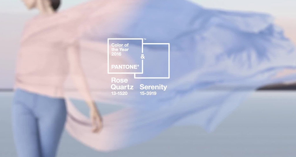
2016 was clearly as difficult year to define as they've taken the unusual step of choosing two colours: Rose Quartz & Serenity:
Pantone also insist that they shouldn't be viewed as two separate colours, but a blending of two shades:
Confusing! A reflection on the blurring of gender roles in our society perhaps, but what does this all mean for us and our homes? How will it affect our design choices?
Before the colour of the year goes public, Pantone releases the colours to marketing companies to start including the chosen colours in design products and make up packaging. Fashion and interior designers are also given the heads up so they can include these colours in their new collections and homeware ranges.
This means that we're going to be seeing a lot of baby blue and baby pink all over the high street, influencing our choice of what we wear, how we accessorise and what we put in our homes.
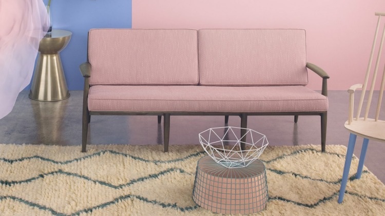
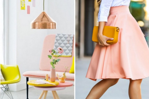
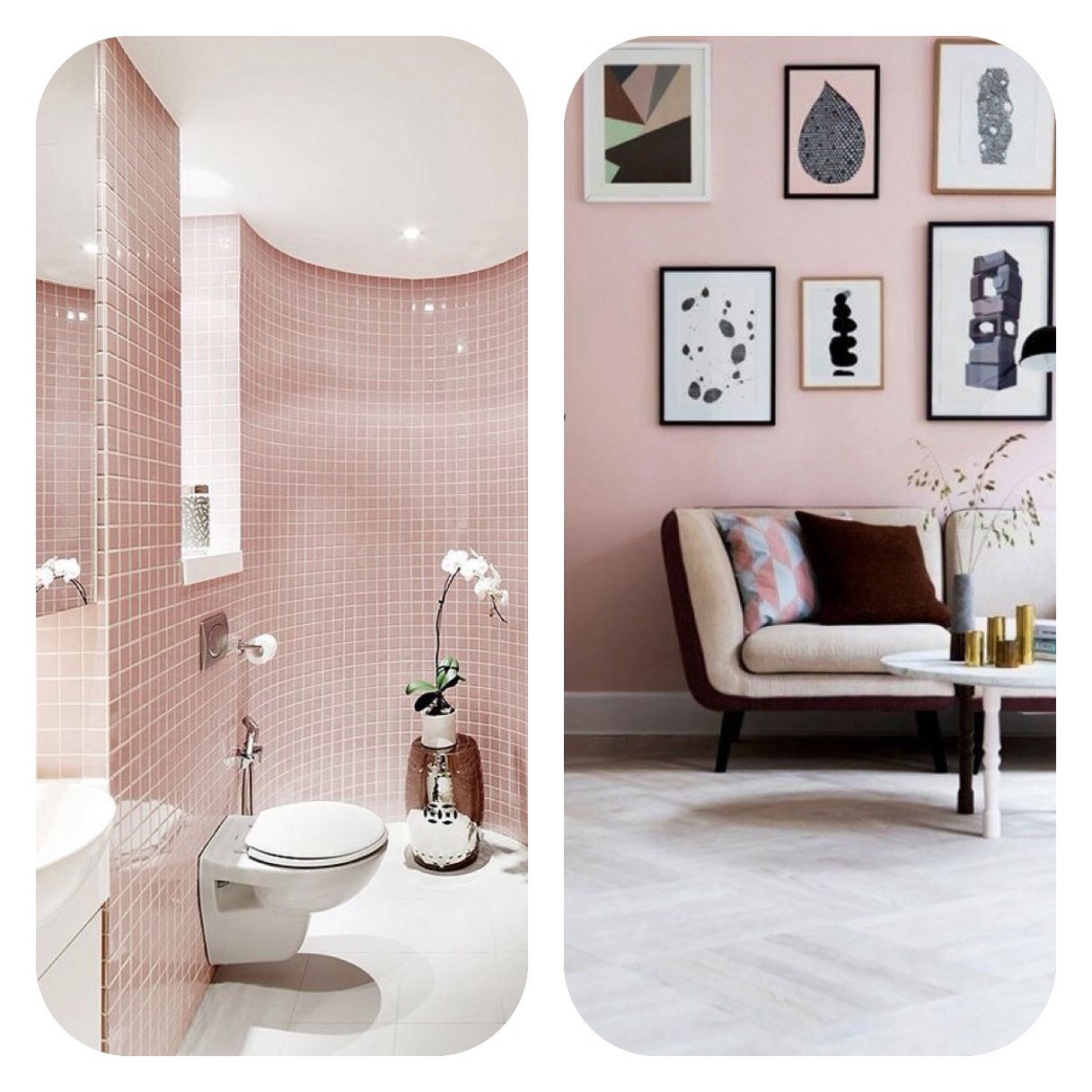
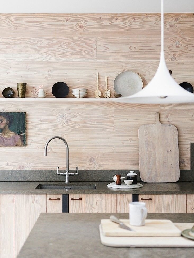
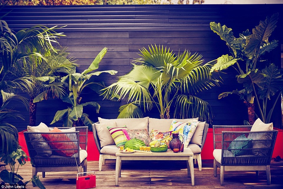
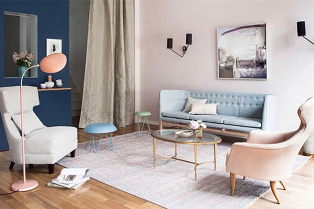
In terms of decorating colours, pink, blush and nude tones are proving the most popular. They are warmer than white, but can still be light and airy. They also provide a great back drop for other pieces of furniture and other colours to stand out. Combined with pops of blue they create a bright, warm palette for Spring and Summer.
Copper metallics (especially in lighting), tan leathers and other pastel colours such as yellow also work well within the scheme. As does more of a monochrome look with white, black and geometric prints.
Although these interiors are beautiful, it is all too easy to get swept along with a particular look because it is popular and prevalent in the shops. When choosing colours, whether the paint for your walls, or the accessories and soft furnishings in your home, always choose according to what you like and, most importantly, what you can live with day in and day out.
Here are some top tips for choosing colours:
- Light is the single major factor when choosing colour, they will all look different in different spaces. Use a tester pot to paint a big square of cardboard with the colour you had in mind and stick it to the wall in the room. You'll soon see if it works or not.
- Colour should be used like a thread, running through a space in a way that knits the room together. For example, if you have a beautiful painting which you love, look at the colours within it and use these as the basis for decorations. Pick out one or two and you can use these colours (or light/darker shades of them) in soft furnishings within the room.
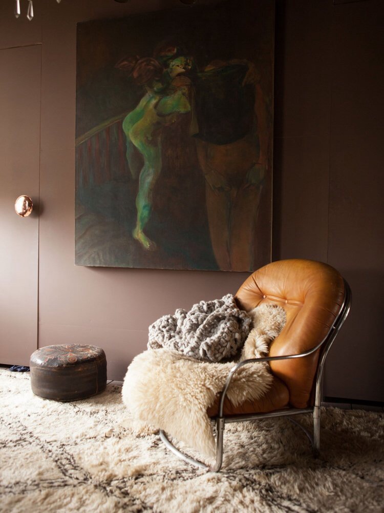
- If a space is dark, try going with it, rather than fighting it. Make the darkness a feature and embrace a similar tone for the walls. You can add a bright statement piece of furniture or funky artwork or pictures, which will really pop against the background. Equally, you can create a cozy retreat with warmer fabrics such as wool and velvet, tartan prints and a fur rug.
- When decorating a particular room, it can be helpful to divide the colours into percentages: 60% of a dominant colour, 30% of a secondary colour, 10% of an accent colour. Translated to a room setting, it typically means: 60% of the room's colour is the walls, 30% of the room's colour is the upholstery, 10% of the room's colour is, say, an accent piece or a floral arrangement.
However you decide to decorate or whatever colour you choose, most of all love it and enjoy it!
beautiful foundations claims no credit for any images posted on this site unless otherwise noted. Images on this blog (beautiful-foundations.com) are copyright to their respectful owners. If there is an image appearing on this blog that belongs to you and you do not wish for it to appear on this site, please contact me with details of which image you refer to and it will be promptly removed. Any image on this site is here because it is thought to be beautiful.
